The Influence of Colors on Artistic Expression: How the Palette Affects Emotions and Messages

The Intricate Dance of Color and Emotion
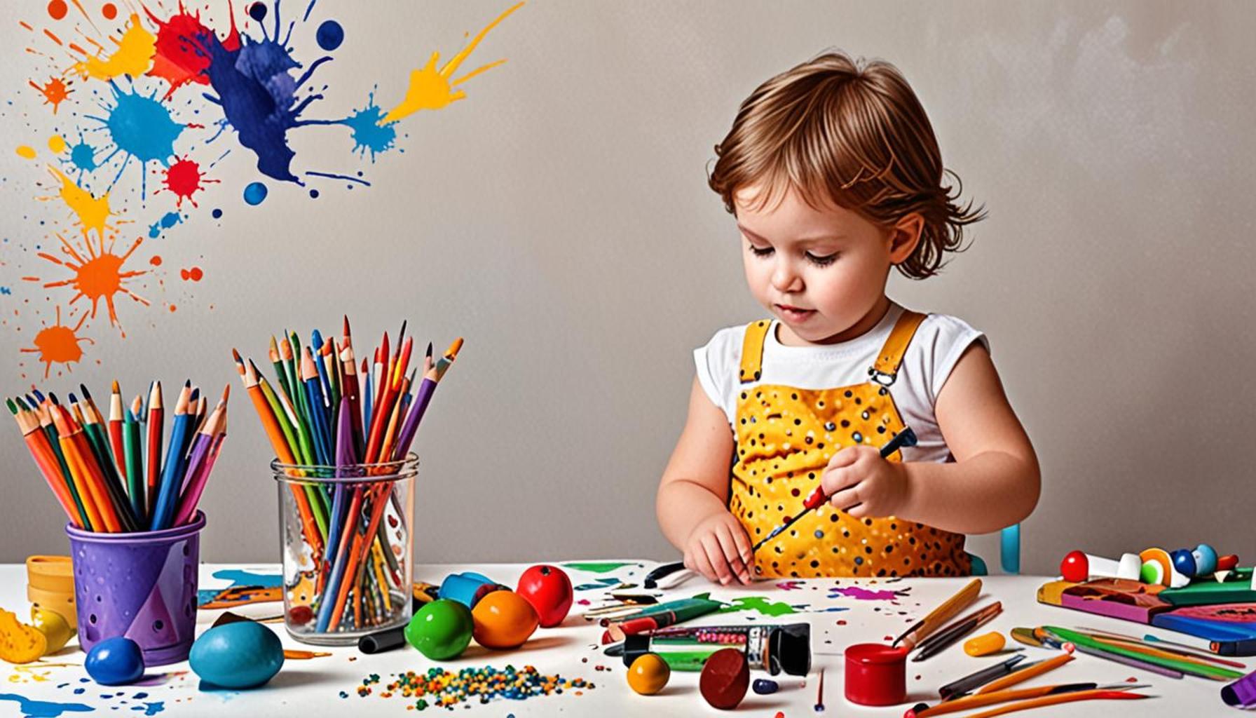
Colors permeate our lives, shaping not only our aesthetic experiences but also our emotional landscapes. The capacity of colors to stir complex feelings and convey narratives without uttering a single word is a phenomenon that artists have skillfully tapped into for centuries. The exploration of this interplay offers profound insights into human psychology and cultural narratives.
One of the most fascinating aspects of color is its psychological effects. Each color tends to evoke distinct emotional reactions. For instance, shades of blue are often associated with tranquility and introspection, likely due to their prevalence in nature, such as the sky and water. In stark contrast, the vibrancy of red can induce feelings of excitement and urgency; it’s a color that often demands attention. This understanding influences not just artists but also marketers who utilize colors strategically. For example, fast-food chains like McDonald’s use red and yellow in their branding as these colors create a sense of appetite and urgency, encouraging faster dining decisions.
Moreover, cultural associations play a pivotal role in how colors are perceived and interpreted. While white is commonly linked with purity and new beginnings in Western cultures, it represents mourning and loss in some Eastern traditions, such as in China and India. Understanding these cultural contexts is essential for artists and communicators who wish to convey more than surface-level meanings in their work. For example, when Ai Weiwei created his installations, he chose colors carefully to resonate with the political tensions in China, reflecting not just his individual perspective but also broader societal emotions.
The symbolism in art cannot be understated. Artists intentionally select specific colors to weave intricate narratives and themes into their work. Think about Edvard Munch’s iconic “The Scream,” where the haunting colors amplify the emotional intensity of existential dread. Alternatively, the lush greens and earth tones in Andy Goldsworthy’s environmental art evoke a sense of harmony with nature, prompting viewers to reflect on their own relationship with the environment.
As we embark on this colorful exploration, we unveil not merely the mechanics of color theory but also the profound impact this knowledge has on our interpretation of art. Each brushstroke speaks volumes through color choice, guiding us through an emotional journey that resonates on a deeply personal level. Understanding how artists manipulate color offers a richer appreciation of their work and, in turn, a greater comprehension of our own emotional responses to various stimuli in the world around us. This intricate dance of color and emotion invites all of us to engage with art more profoundly and to ponder the daily emotional dialogues we have with the colors that surround us.
DIVE DEEPER: Click here to discover more
The Psychological Palette: Understanding Color Emotions
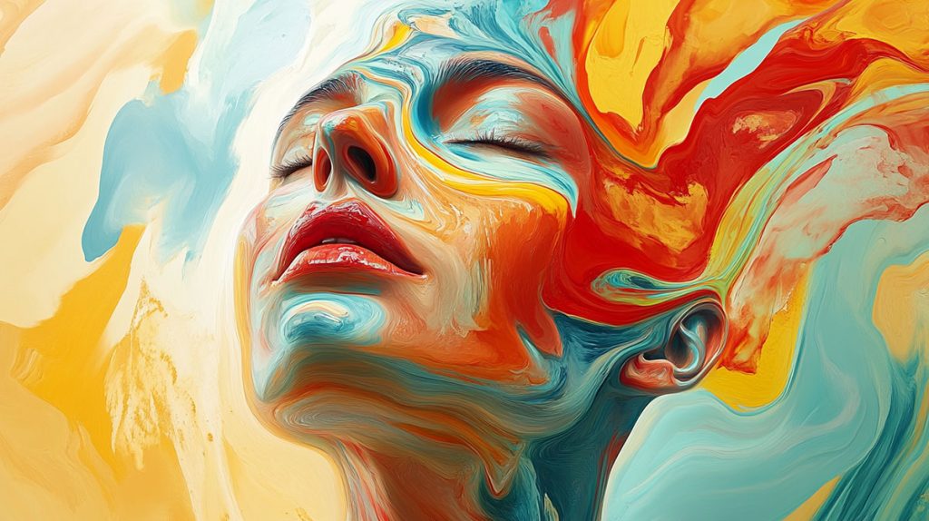
As we peel back the layers of color in artistic expression, we find a fascinating mixture of psychology and cultural depth that shapes human sentiment. The emotional impact of color is a critical element for artists seeking to evoke specific feelings and reactions from their audience. Research in psychology suggests that colors can be categorized into warm and cool tones, each carrying distinct emotional weights.
Warm colors, including reds, oranges, and yellows, are often associated with energy, vibrancy, and passion. Artists frequently harness these colors to create a sense of urgency or to highlight crucial moments within a piece. Take Vincent van Gogh’s “Sunflowers,” for example; the warm yellows expressed not just joy but also a sense of fervor and vibrancy that invites the viewer into a lively scene. In contrast, cool colors, such as blues, greens, and purples, are linked to calmness, introspection, and an ethereal quality. They are often used to convey tranquility or contemplation. Think of Claude Monet’s water lilies, where blues and greens merge beautifully to evoke serenity and reflection.
Venturing further into color theory, artists often consider the effects of color combinations. The harmony or discord created by contrasting hues can significantly impact the viewer’s emotional response. For example, complementary colors, such as red and green, can generate excitement or tension, making them powerful tools in storytelling through art. A prime example can be seen in the expressionist works of Henri Matisse, where vibrant hues interact, resulting in a line of emotion that dances across the canvas.
Key Emotional Associations with Colors:
- Red: Passion, anger, urgency
- Blue: Calmness, sadness, serenity
- Yellow: Happiness, energy, optimism
- Green: Nature, growth, tranquility
- Purple: Mystery, luxury, creativity
- Black: Power, elegance, mourning
- White: Purity, peace, innocence
This nuanced understanding of color psychology not only shapes artistic expression but also influences how audiences interpret and connect with the artwork. By exploring these associations, artists can deliver powerful messages that resonate on multiple levels. Furthermore, the use of color in various cultures often reveals significant meanings behind artistic choices, allowing for broader communication. For instance, artists leaning into vibrant colors in African art often celebrate life and vitality, contrasting with the more muted tones sometimes favored in traditional Eastern art that may convey wisdom and introspection.
In examining the profound influence of colors on artistic expression, we unearth a deep-rooted conversation about feelings and perceptions shared across cultures. As we further delve into the relationship between colors, emotions, and messages, we illuminate how color choices shape not only the aesthetics of art but also influence the stories told through every piece, drawing us into a vast canvas of shared human experience.
Colors haunt the corridors of our subconscious, subtly guiding our emotions and perceptions in profound ways. Research in psychology reveals that specific colors elicit strong, often involuntary feelings. For instance, red is linked to passion and urgency, making it a popular choice for brands aiming to stimulate action. On the other hand, blue often evokes feelings of calmness and trust, which is why it is frequently used in corporate branding and social media platforms.
Artists across various mediums have long understood the psychological implications of color choice. A vibrant yellow may convey happiness and warmth, while a darker palette might evoke somber or reflective feelings. For example, Vincent van Gogh’s use of bright yellows in “Sunflowers” radiates joy, contrasting sharply with the melancholic blues of “Starry Night,” which reflects his inner turmoil. This powerful display showcases how color palettes can transform a piece from merely visible to deeply emotional and resonant.
Moreover, the impact of color is not isolated to individual preferences; cultural contexts also play a significant role. In Western cultures, white signifies purity and peace, often seen in wedding dresses, while in some Eastern cultures, it represents mourning. This disparity highlights the importance of cultural sensitivity and awareness in artistic expression, reinforcing the idea that a palette can carry varied meanings across different audiences.
As we delve deeper into the world of color theory, we uncover layers of complexity that reveal how color can manipulate emotions, communicate messages, and forge connections. For artists, understanding these nuances is invaluable, empowering them to enhance their work’s narrative and emotional resonance.
| Color Psychology | Emotional Impact |
|---|---|
| Red | Elicits passion, urgency, and energy; often used in marketing to create a sense of excitement. |
| Blue | Promotes calmness, trust, and stability; commonly seen in corporate branding. |
Exploring how artists manipulate color can unlock fresh perspectives for both creators and audiences alike. Understanding these principles not only enriches our appreciation of art but also invites us to examine our personal emotional responses ignited by various hues in our everyday lives.
EXPLORE MORE: Click here to discover how creative writing can enhance your language skills
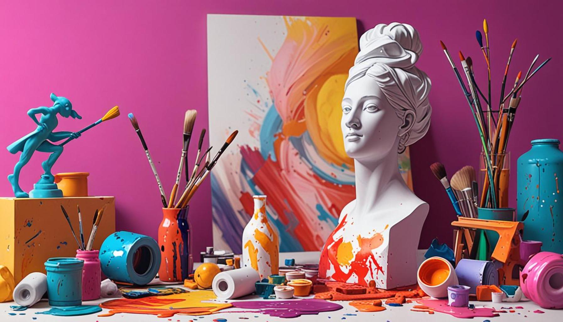
Color Dynamics: Nuances in Artistic Representation
As we dive deeper into the influence of colors on artistic expression, it’s essential to consider how context and technique intertwine with color choices to enhance emotional resonance. Artists are not simply selecting colors for their aesthetic appeal; they are engaged in a broader dialogue that includes the viewer’s personal experiences and societal context. This interplay is most evident in how colors are utilized across different artistic movements, each interpreting emotions differently based on cultural circumstances.
For instance, the Impressionist movement embraced vibrant colors to convey fleeting moments and evoke emotional responses tied to nature and everyday life. Artists like Pierre-Auguste Renoir often applied broken brush strokes that created luminous effects, reflecting the beauty of a sunlit scene while instilling feelings of warmth and delight. In contrast, the Post-Impressionist approach, exemplified by artists like Paul Gauguin, often favored more symbolic uses of color to convey deeper emotional and spiritual messages. By employing vivid, non-representational colors, Gauguin explored themes of identity and existential questioning, effectively altering the viewer’s emotional trajectory within the artwork.
Additionally, the Symbolist movement introduced a new layer of depth to color application by linking hues directly to emotions or concepts. Artists such as Odilon Redon utilized color to create dream-like atmospheres, inviting viewers into a world shaped by internal feelings rather than external reality. Colors in Redon’s work can often evoke dreams of nostalgia or trepidation, marking the viewer’s psyche profoundly. This notion illustrates how the intentional application of color can lead to the depiction of more complex emotional landscapes, serving as harbingers of deeper meanings.
The Cultural Canvas: Colors in Context
The cultural implications of color cannot be overstated. Colors often carry varied meanings depending on the cultural backdrop. For example, while red may universally signify passion and urgency, in certain Eastern cultures it symbolizes good fortune and celebration. When artists like Japanese ukiyo-e masters employed red, it was meant to invoke feelings of prosperity and joy, creating an uplifting visual experience. Conversely, artists in Western contexts may channel red to express themes of conflict or desire, showcasing how cultural interpretations of color shape artistic expression.
- Cultural Significance of Color: In African art, bright colors often represent life experiences and cultural heritage, contrasting with more subdued pallets seen in European classical traditions, signifying introspection and thought.
- Regional Palette Variations: Contemporary American artists may draw upon the vibrant palettes found in Indigenous artwork or the stark contrasts in urban street art, each bearing an emotional weight reflective of their origins.
This multifaceted understanding of color leads us to recognize the palette as a narrative tool that not only shapes individual experiences but also reflects broader societal dialogues. Artists can engage viewers on emotional levels through careful manipulation of hues, tones, and cultural significance. Such insights into the influence of color challenge us to question our interpretations and experiences, paving the way for rich conversations that celebrate the profound power of color in artistic expression.
DISCOVER MORE: Click here to learn about the intersection of craftsmanship and sustainability
Conclusion: The Vibrant Language of Color
In summary, the influence of colors on artistic expression transcends mere visual appeal, serving as a complex language through which artists convey emotions and narratives. By understanding the dynamics of color—its cultural significance, the emotional responses it evokes, and its contextual applications—we uncover a deeper appreciation for art. Each choice of hue represents not only the artist’s intention but also the viewer’s interpretation, marking an intricate dialogue that shifts with time and perspective.
The exploration of various movements, from the sunlit scenes of the Impressionists to the symbolic depths of the Post-Impressionists and the dreamlike tones of the Symbolists, highlights how color functions as a narrative tool that articulates complex emotional landscapes. Furthermore, the cultural context surrounding colors reminds us of the diverse interpretations that can arise across different communities and historical backgrounds. For instance, as contemporary American artists infuse traditional Native American palettes into their work, they also channel a rich history of emotional resonance and cultural identity.
As artists continue to experiment with colors and their meanings, they challenge audiences to engage more thoughtfully with their art. This interplay invites us to expand our understanding and appreciation of artistic expression, recognizing that each stroke of color is steeped in intention and evokes a spectrum of feelings. Thus, exploring the palette’s role in emotional communication not only enhances our connection to art but also enriches our appreciation for the stories and feelings embedded within every masterpiece.